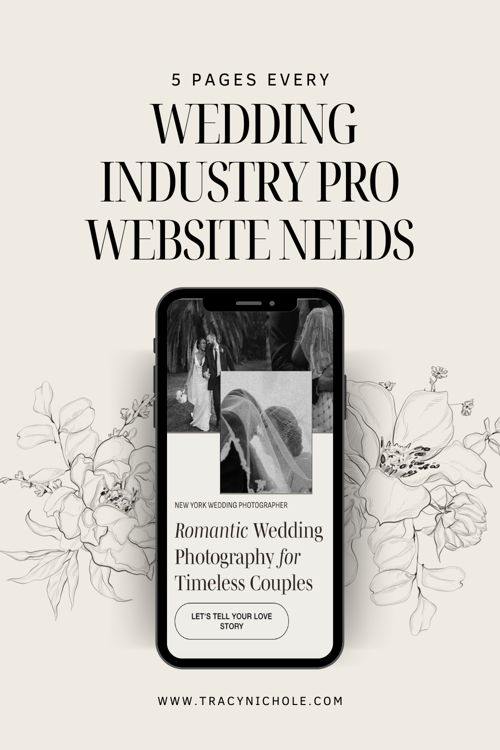
5 Pages Every Wedding Industry Pro Website Needs
Your website is the first stop for couples to catch your vibe and see what you're all about, and for wedding pros like you, each page should serve a specific purpose, offering value and connecting with potential clients right from the get-go.
Having these five essential pages—Homepage, Services, About, Portfolio, Blog, and Contact—sets the stage for a website that not only looks beautiful, but is designed to convert visitors into clients.
Here’s the rundown on what each page should accomplish and the must-have elements that will get you booked up for wedding season.
1. Homepage: The First Impression
Think of your homepage as the cover page of a book—it’s the first thing couples will see, and it sets the tone for the entire website. This page needs to instantly convey who you are, what you do, and what makes you unique in the wedding industry. Essentially, it’s your elevator pitch, so make sure it’s polished!
What to Include:
A Catchy Headline: Your headline should clearly communicate what kind of wedding pro you are (planner, photographer, florist, etc.) and who your services are for.
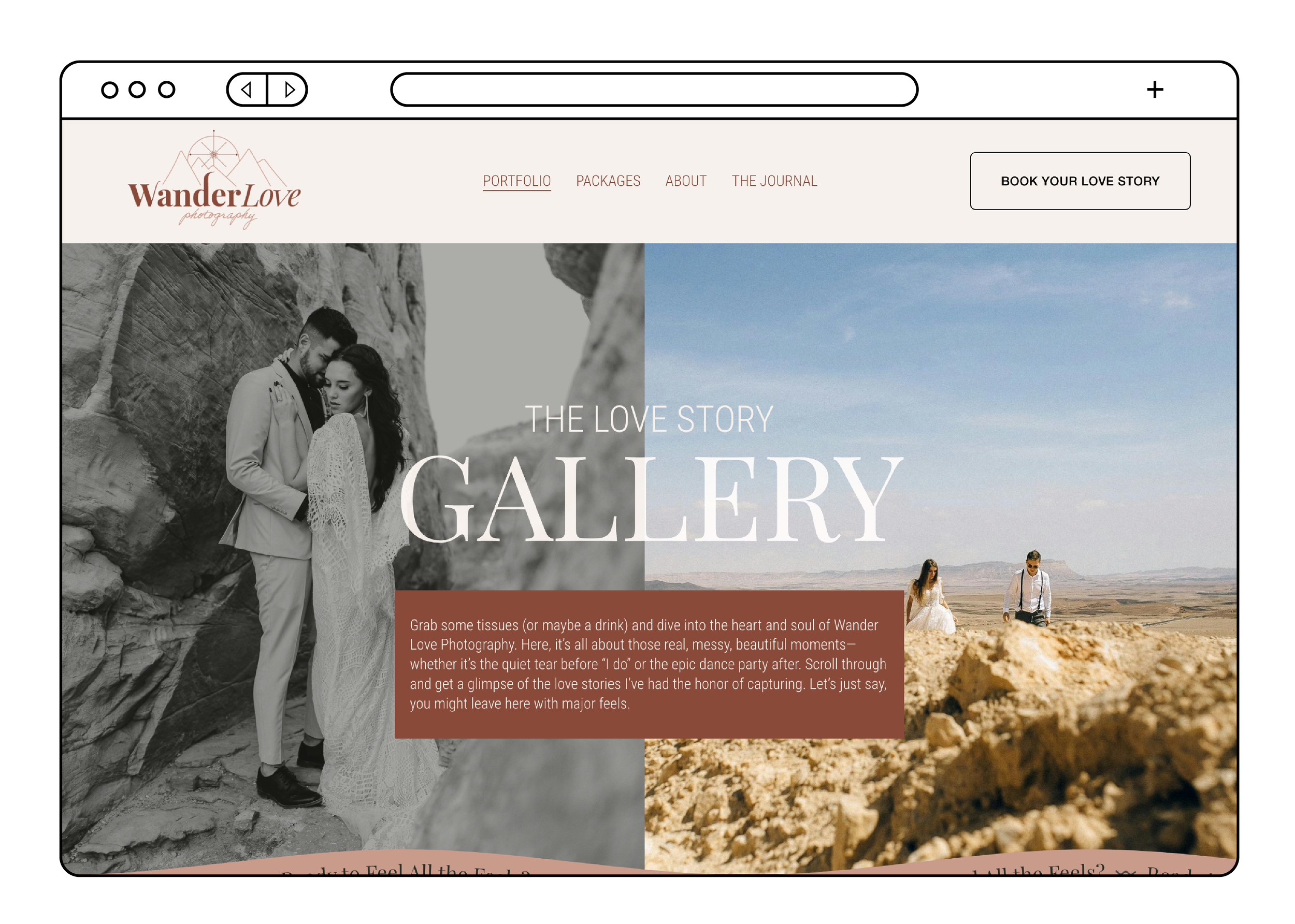
Hero Image or Video: Show an eye-catching image or short video that represents your best work and captures the emotion of a wedding day.
Brief Overview of Services: Don’t dive into every detail here—that’s what the Services page is for. Just provide a taste of what you offer, like “wedding planning for the modern couple” or “timeless wedding photography for unforgettable memories.”
Call to Action (CTA): Make it super easy for couples to take the next step, whether that’s contacting you, viewing your portfolio, or exploring your services. A button with a CTA like “Let’s Plan Your Perfect Day” is ideal.
Why It Matters: Your homepage gives potential clients a snapshot of what to expect throughout your website. If this page doesn’t capture their attention or make them feel like you “get them,” they may click away. Your goal is to show couples right away that they’re in the right place.
2. Services Page: Show What You Offer (and Be Transparent on Pricing)
Your services page is where you spell out the details of what you do. Couples are searching for clarity—what exactly do you offer, and at what price? You don’t have to go super in-depth (keep it client-friendly, not overwhelming), but this is where you make it clear what working with you looks like. Spoiler alert: I fully believe in sharing your prices on your website.
What to Include:
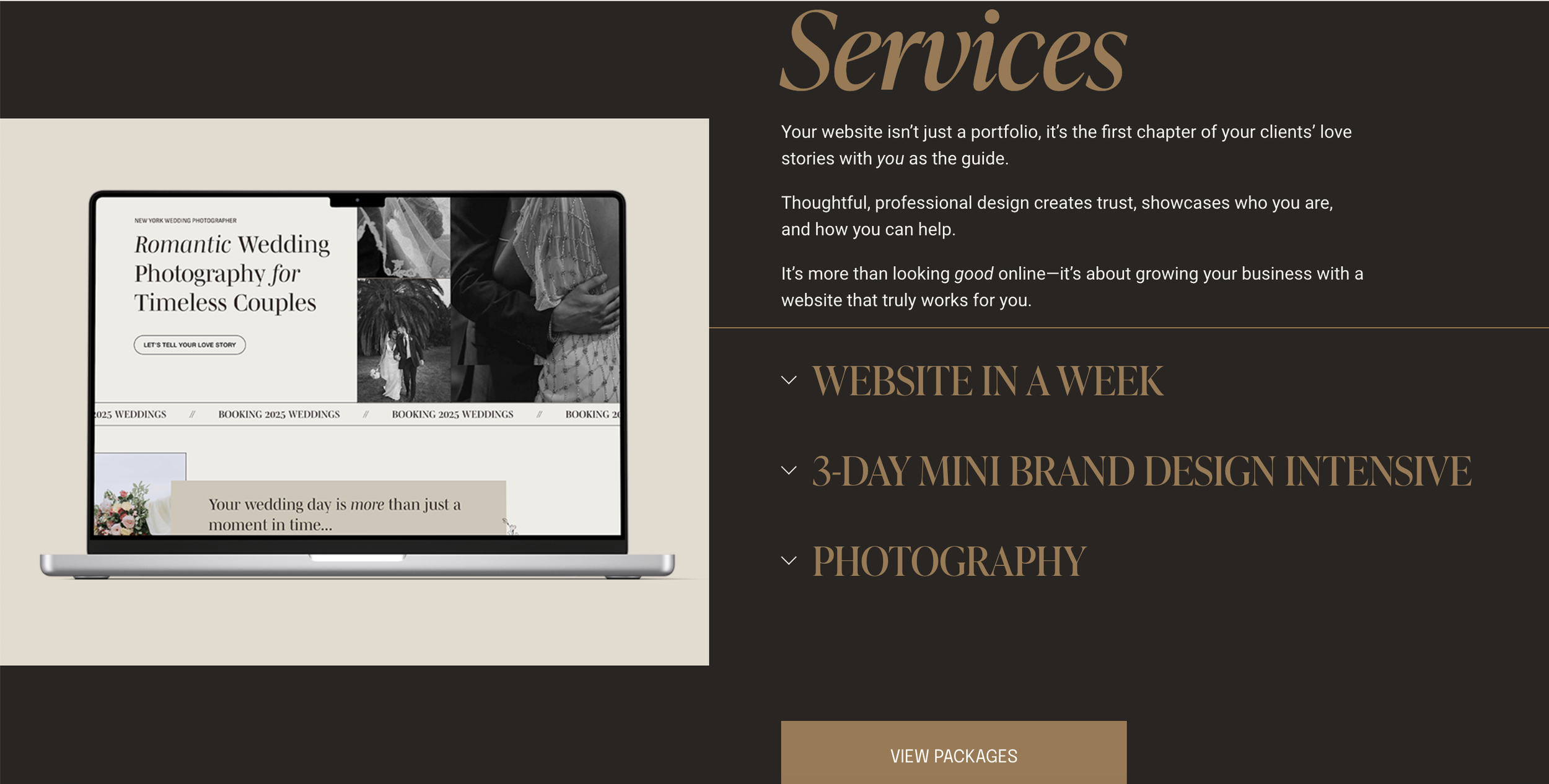
Service Descriptions: Break down your offerings into clear packages or services. For instance, if you’re a wedding photographer, outline what’s included in an engagement session, wedding day package, and any other add-ons like albums or videography.
Starting Rates or Price Ranges: Transparency is key here. If possible, disclose your rates or at least a starting range. Many couples won’t bother filling out your contact form if they have no idea about pricing. A simple “Packages start at $2,000” gives them a baseline without locking you into a final number.
Add-Ons and Customization Options: If you offer add-ons like extra hours of coverage, event styling, or destination travel, list those options. It gives clients a sense of customization, and they can start visualizing a tailored experience.
Why It Matters: Couples don’t want to play a guessing game. If it’s not easy to understand what you offer or if they can afford it, they’ll likely move on to someone else who makes that info easy to find. Being upfront about your starting rate or general price range not only helps filter out mismatched clients but also builds trust by being transparent.
3. About Page: Share Your Story
Your “About” page is where you let clients in on who you are. The truth is, couples hire wedding professionals not just because of what they do, but because of who they are. They genuinely need your help, so your “About” page should be personal, relatable, and give potential clients a chance to connect with you on a human level.
What to Include:
Your Background and Expertise: Briefly share your journey into the wedding industry—what drew you to it, how you developed your craft, and why it’s more than just a job for you.
Your Values and Style: Let clients know your core values as a wedding planner or photographer (like attention to detail or a passion for storytelling) and describe your style (romantic, modern, elegant, etc.). This helps attract couples who resonate with your approach.
Fun Facts and Personality: A few fun details can go a long way. Maybe you’re obsessed with coffee, love traveling to new places, or have a rescue dog who’s your business mascot. Anything that feels authentically you can help clients feel like they’re getting to know a real person.
Why It Matters: The wedding industry is all about personal connections. The “About” page is where couples decide if they vibe with you. It’s a chance to build trust and form a connection that makes them excited to work with you rather than a faceless brand.
4. Portfolio: Let Your Work Speak for Itself
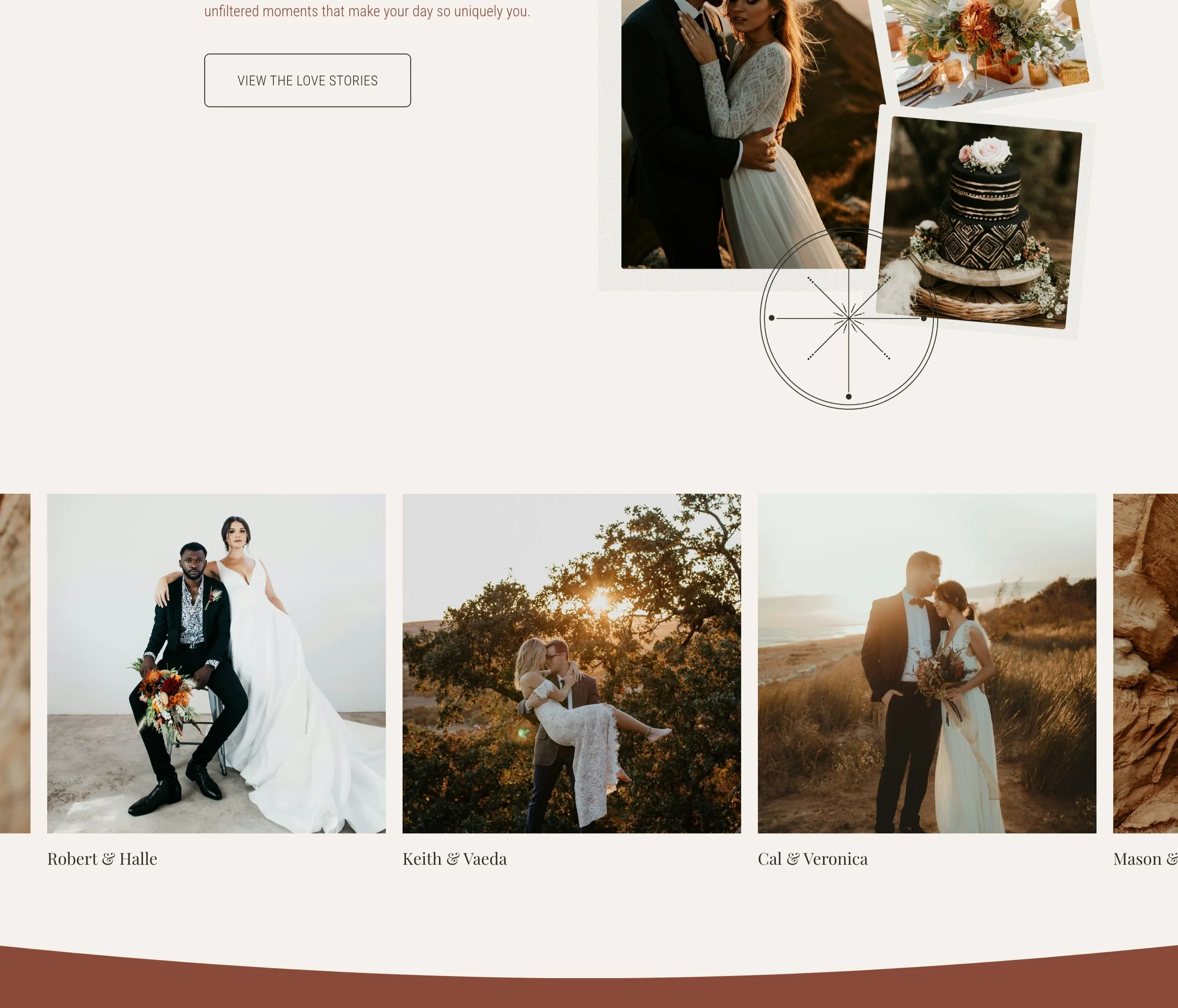
Your portfolio is probably one of the most important pages on your website. This is where you showcase your talent, style, and experience as a wedding creative. But remember, less is more—only include your best work.
What to Include:
Curated Selection of Best Work: Resist the urge to include every single wedding you’ve ever done. Instead, choose a variety of shots that represent your style and highlight the types of weddings you want to attract.
Categorized Galleries: If you work across multiple styles or offer different types of services, consider creating separate galleries or sections. For instance, you could have “Outdoor Weddings,” “Intimate Gatherings,” and “Grand Events” galleries to make it easy for couples to find inspiration.
High-Quality Images: Make sure your images are high-resolution and optimized for web. A blurry or low-quality image can make even the best work look amateurish.
Why It Matters: Your portfolio gives potential clients a visual preview of what they can expect if they hire you. Curating a professional, cohesive portfolio helps attract the types of couples you want to work with and makes them feel confident in your abilities.
5. Blog: A Hub for Local SEO and Client Attraction
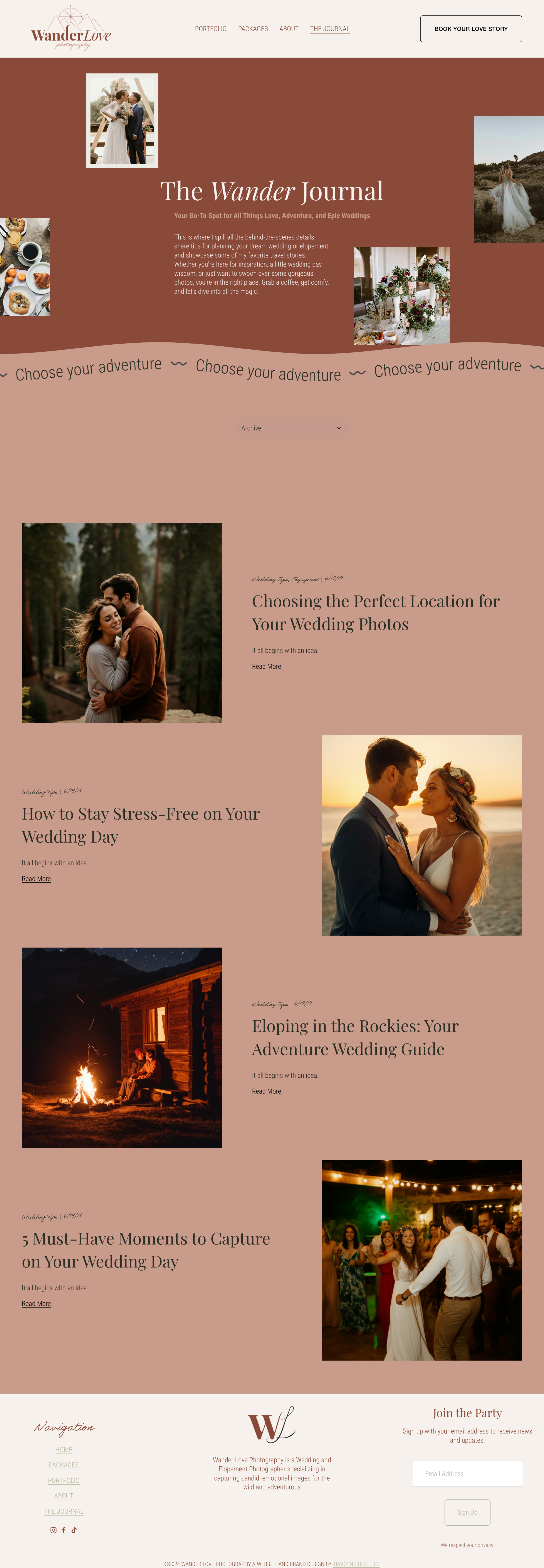
Your blog can be a powerful tool to attract local clients and build credibility in your field. By writing about relevant topics, like planning tips, wedding trends, or local venues, you’re not only providing value to your audience but also improving your SEO (search engine optimization) so more clients can find you.
What to Include:
Local and Relevant Content: Write blog posts that highlight your local area. For example, posts like “Top 5 Wedding Venues in Grand Rapids” or “Wedding Season Tips for Traverse City”, “Art Deco Styled Wedding at The Graduate Hotel East Lansing”, can help you show up in local search results.
Wedding Advice and Tips: Share insights on popular wedding themes, trends, and planning advice. This shows potential clients that you’re an expert in your field and positions you as a trusted source.
Real Weddings: Share stories from real weddings you’ve worked on, showcasing your work and connecting with new clients. Real wedding features also help with SEO as they naturally include keywords related to wedding planning.
Why It Matters: Blogging consistently gives Google more content to index, which helps boost your site’s visibility. Plus, each post you write is a new opportunity to reach local couples searching for wedding pros in your area.
6. Contact Page: Make It Easy for Clients to Reach Out
Your Contact page should be straightforward and inviting. After getting them excited about your services, make it easy for clients to take that final step and reach out.
What to Include:
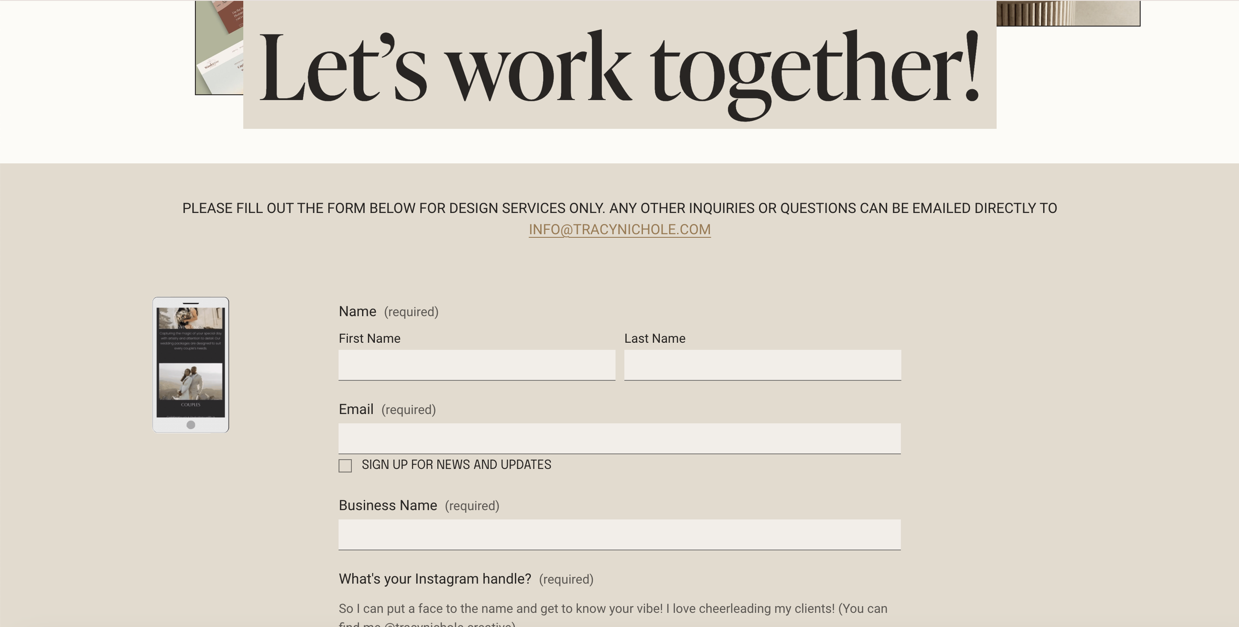
Simple Contact Form: Include fields that capture necessary information without overwhelming visitors. You might ask for their names, wedding date, venue (if they have one), and a brief message.
Optional Questions: Consider including optional fields like how they heard about you or what they’re looking for in your wedding services. This can help you gauge their needs right off the bat.
Multiple Contact Options: While contact forms are great, you should always include your email address and social links on the same page so that potential clients can contact you without using the form. What if they have a simple question and it’s the deciding factor on whether they book with you or not? They shouldn’t have to fill out a whole contact form to get their answers. Rule of thumb: don’t only rely on the form.
Why It Matters: If clients can’t figure out how to contact you quickly, they may leave for another site. Keep the process simple and inviting, so couples feel welcomed and ready to take that next step.
Creating a website that includes these five essential pages will give your clients all they need to see who you are, what you do, and why they want you to be part of their wedding day. Remember, a website for a wedding professional isn’t just an online presence—it’s your chance to connect, inspire, and get those bookings rolling in.

